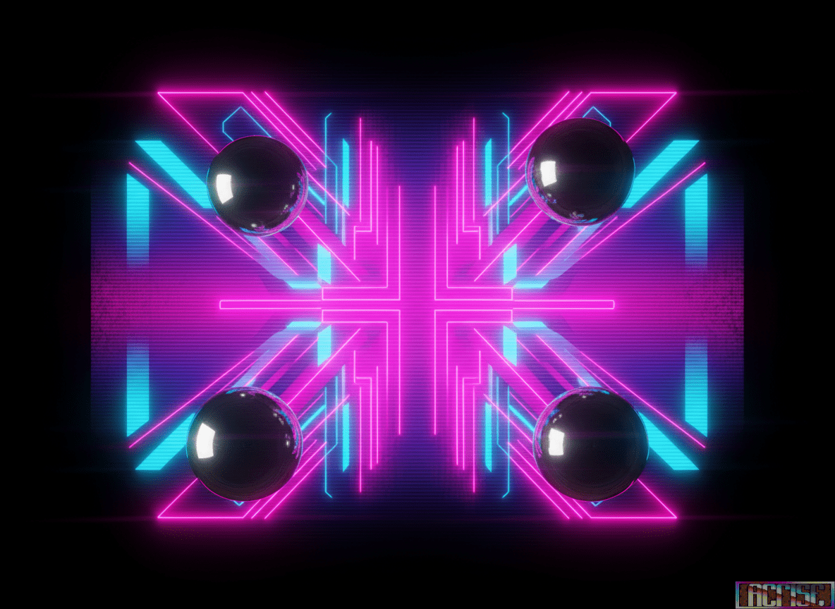
There’s a visual vibe quietly resurfacing across intros, loading screens, and scene art: high-contrast neon minimalism—the kind of look that feels half 80s arcade flyer, half modern synthwave poster, but still unmistakably C64 when it hits the screen.
It’s not “new,” but it’s evolving. Instead of trying to imitate modern 3D, creators are leaning into graphic design energy: bold silhouettes, hard gradients, scanline illusions, chrome-like highlights, and color choices that feel intentional rather than “whatever fits in the palette.” The result is a style that reads instantly on a CRT and still looks sharp in captures.
What makes it work on the C64 is the same thing that makes great demo design timeless: composition and rhythm. A simple shape becomes powerful when it’s staged with the right spacing. A limited palette becomes luxurious when it’s used with discipline. And a basic raster trick becomes “premium” when it’s synchronized with a musical phrase.
We’d love to see more releases that treat the C64 like a poster printer with attitude:
- Strong negative space (yes, empty areas can be dramatic)
- Intentional color blocking (less dithering, more design)
- Typography-inspired layouts (even without readable text)
- “Album cover” framing for parts and transitions
If you’re working on something right now, consider trying a “synthwave pass” on one screen: reduce the clutter, pick 3–5 dominant colors, and build a composition that could be a cover. The machine will reward you. And the audience will feel it immediately—because clarity is rare, and rare is memorable.
We’ll keep an eye out for releases that push this direction and highlight them soon. If you’ve got a screenshot, a WIP, or a release that nails the vibe, send it our way. The scene doesn’t just run on code. It runs on taste.
Leave a Reply